Goïa
Want to buy the family one?
To download the demo version, you need to create an account and download from it.
Do you have a merchandising project? Contact us to confirm the use and price of typography.
- Goia Classic
- Goia Display
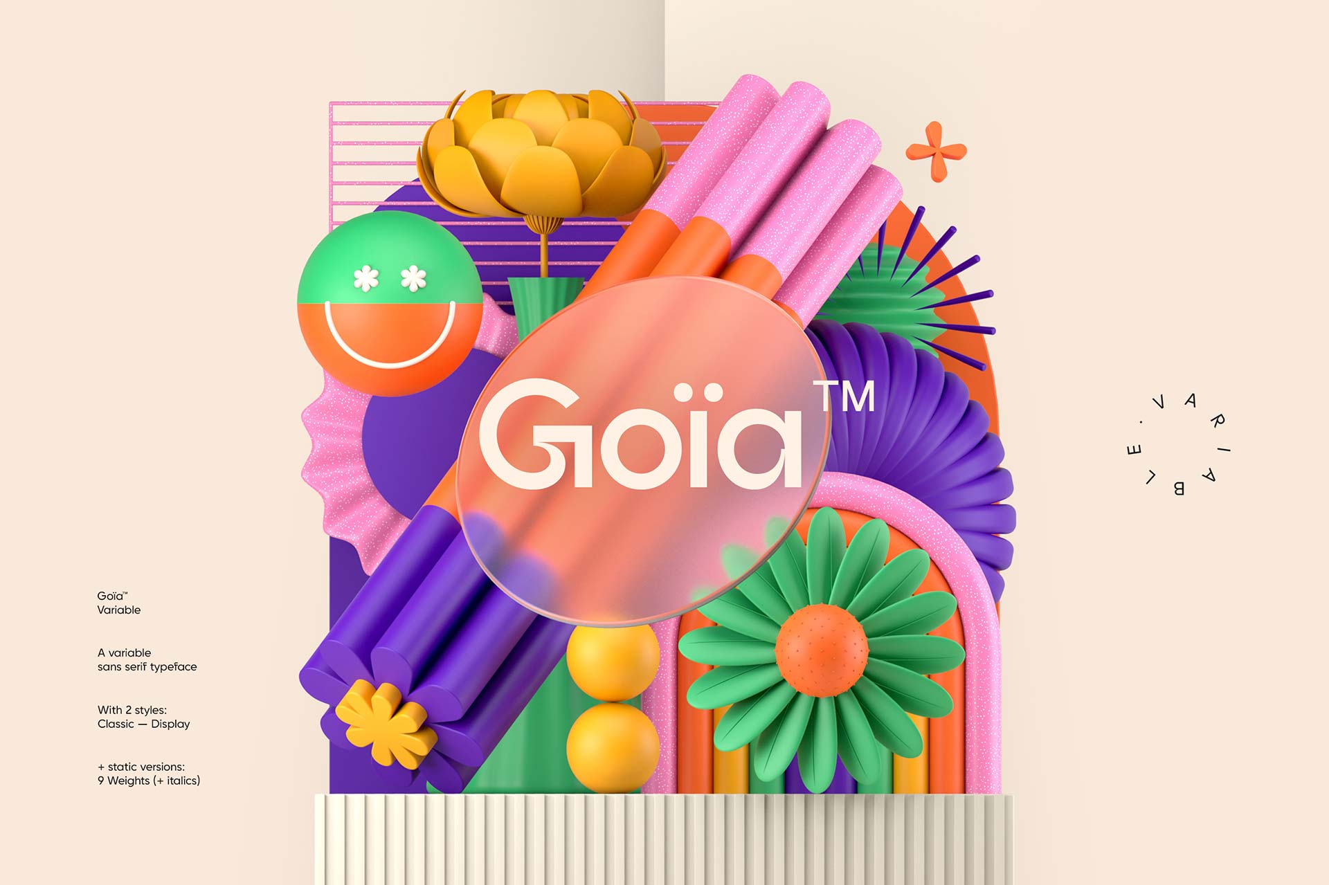
Goïa® - The modern and balanced roundness of simplicity.
Goïa® - A revisited style
Use
A logo, an eye-catching headline or a well-written paragraph, Goïa™ supports all typographic hierarchies. And, if it is so versatile, it is because it has a strong technical asset: it is variable. An uncommon flexibility that we owe to two axes of variation: weight and tilt. We dose the fat to obtain the right thickness. You tilt it delicately, play with the angles and display a subtle, refined italic. Infinite possibilities for unlimited creativity. Its universality already makes it a must for your creations.
And also
1769® Display is also a proof of typographic timelessness. Born from the Romantic movement of the 18th and 19th centuries, it crosses the ages and tells us a part of the past.
I want to travel in time. ->
FLOWERS
BRING COLOR
TO YOUR WORLD
Supported languages
Afrikaans, Albanian, Asu, Basque, Bemba, Bena, Breton, Catalan, Chiga, Colognian, Cornish, Croatian, Czech, Danish, Dutch, Embu, English, Esperanto, Estonian, Faroese, Filipino, Finnish, French, Friulian, Galician, Ganda, German, Gusii, Hungarian, Inari Sami, Indonesian, Irish, Italian, Jola-Fonyi, Kabuverdianu, Kalenjin, Kamba, Kikuyu, Kinyarwanda, Latvian, Lithuanian, Lower Sorbian, Luo, Luxembourgish, Luyia, Machame, Makhuwa-Meetto, Makonde, Malagasy, Maltese, Manx, Meru, Morisyen, Northern Sami, Northern Ndebele, Norwegian Bokmål, Norwegian Nynorsk, Nyankole, Oromo, Polish, Portuguese, Quechua, Romanian, Romansh, Rombo, Rundi, Rwa, Samburu, Sango, Sangu, Scottish Gaelic, Sena, Serbian, Shambala, Shona, Slovak, Soga, Somali, Spanish, Swahili, Swedish, Swiss German, Taita, Teso, Turkish, Upper Sorbian, Uzbek (Latin), Volapük, Vunjo, Walser, Welsh, West Frisian, Zulu.
Credits & details
Variable with 2 Styles
Type Designer : Jérémie Gauthier
Art Direction : Jérémie Gauthier & Romain Billaud
Release date : 2023
Version : 1.0
Formats : OTF, WOFF, WOFF2